
Workshop 2.2: Visualization in Jupyter Notebooks#
Contributors:
Ashwin Patil (@ashwinpatil)
Jose Rodriguez (@Cyb3rPandah)
Ian Hellen (@ianhellen)
Agenda:
Basic plotting with pandas and matplotlib
HVPlot, Holoviews and Bokeh
Seaborn - specialized stats plots and more
Plotly
MSTICPy Visualizations
Notebook: https://aka.ms/Jupyterthon-ws-2-2
License: Creative Commons Attribution-ShareAlike 4.0 International
Q&A - OTR Discord #Jupyterthon #WORKSHOP DAY 2 - VISUALIZING DATA
Disclaimer:#
This is not intended to be a comprehensive overview of Visualization in Python/Jupyter. There are many libraries and techniques not covered here. These are just a few options that we’ve used and liked and give you a lot of scope.
Basic plotting with pandas using Matplotlib#
Resources:
Cheatsheets :
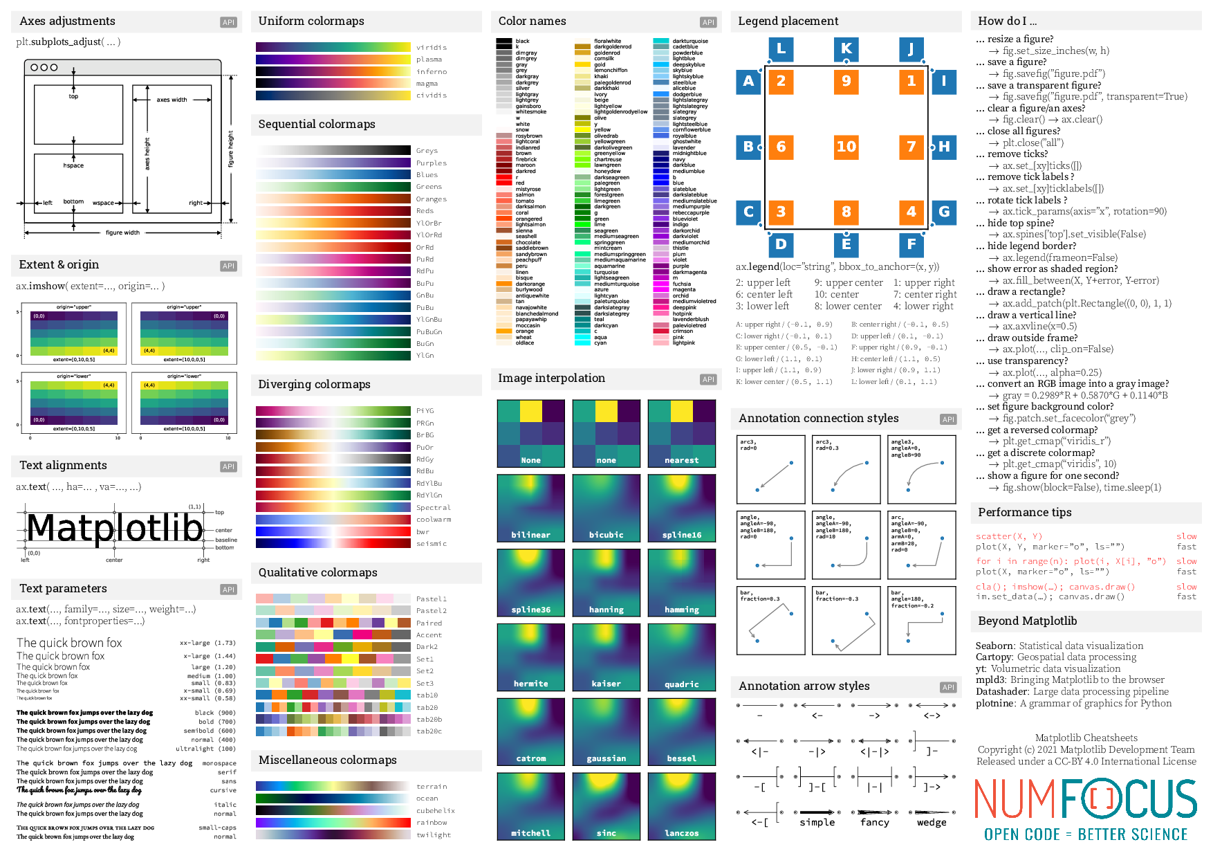
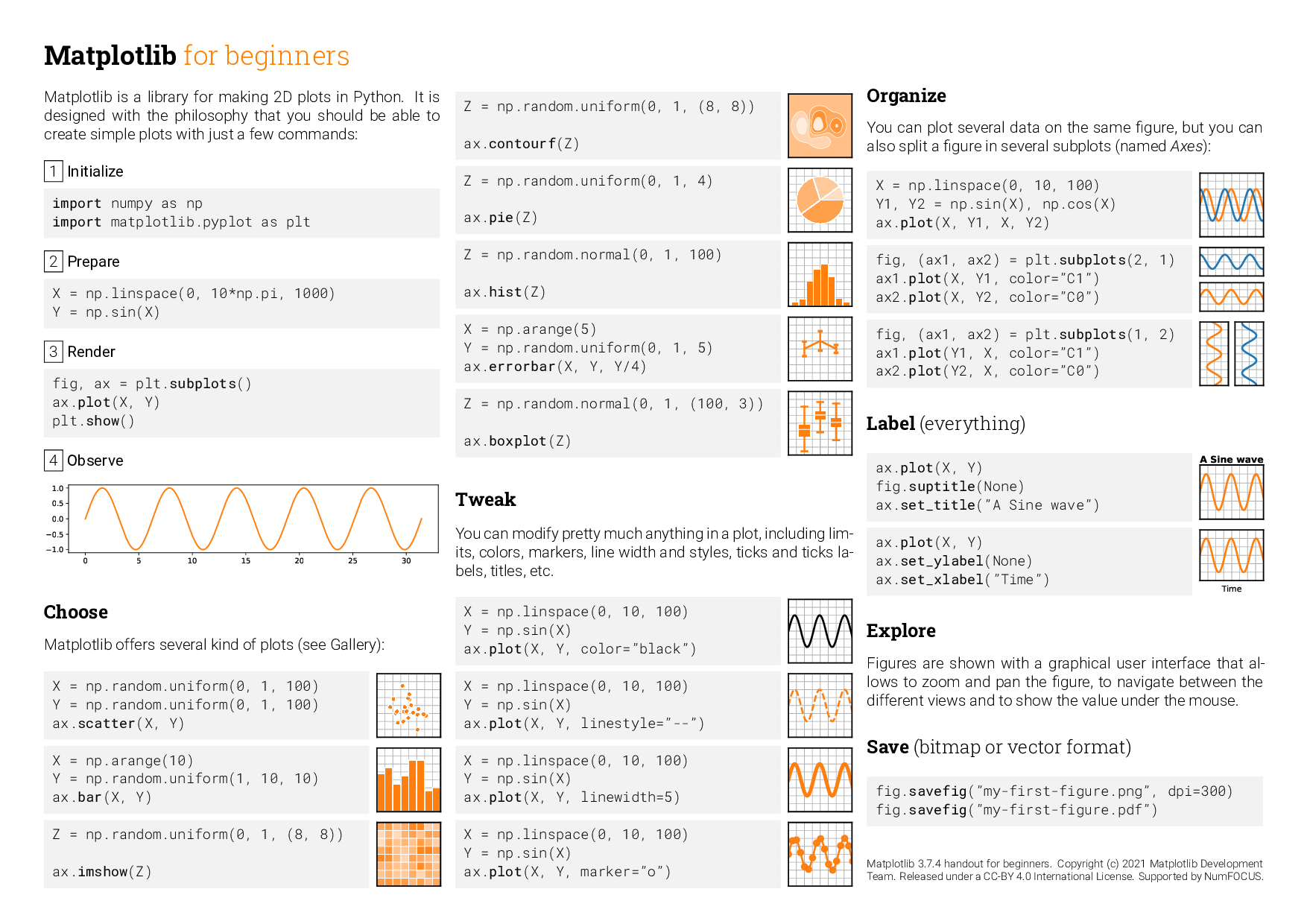
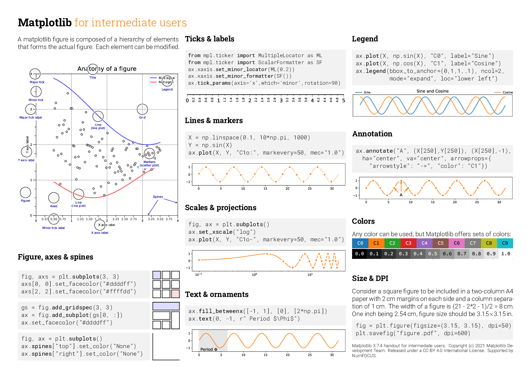
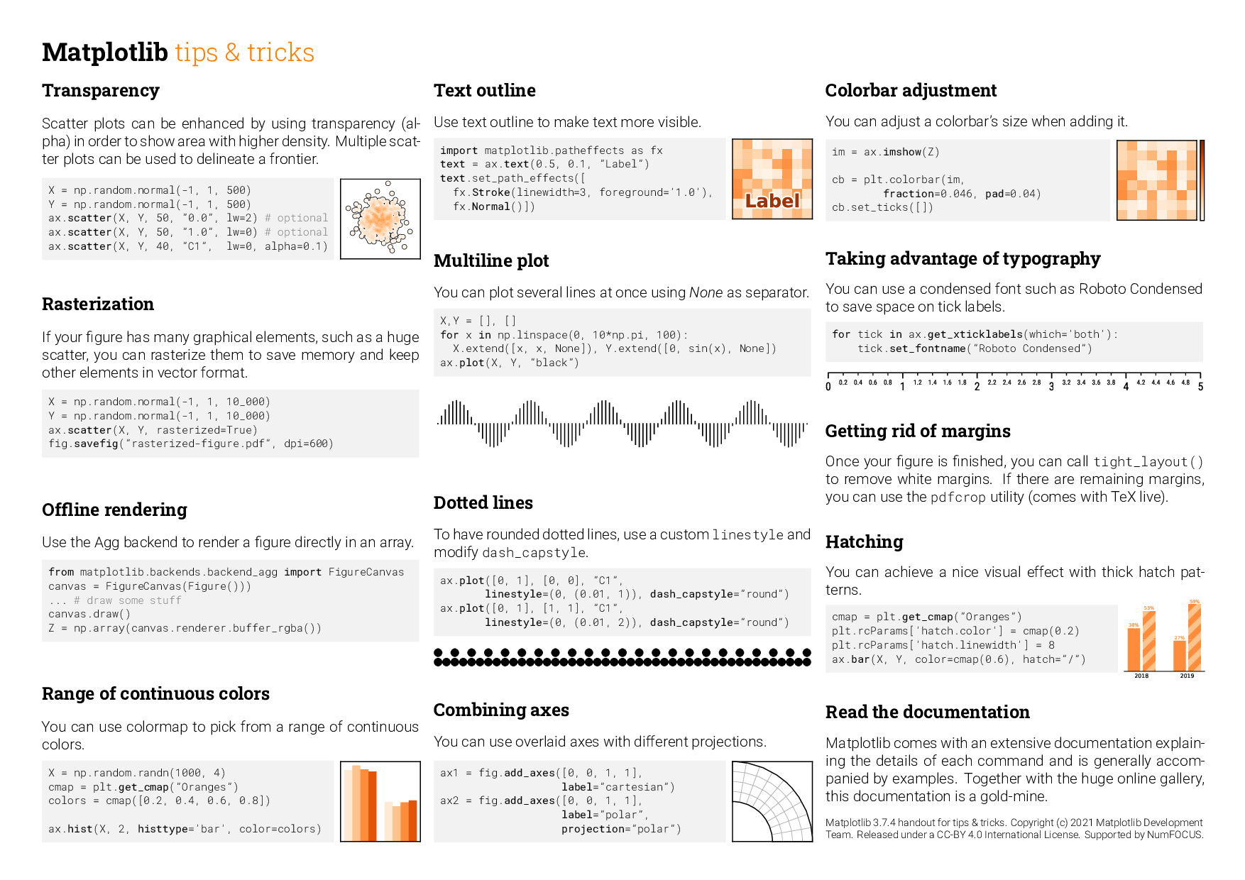
![]()
Matplotlib Cheatsheets#
Bar charts#
Refer Bar Plots section for more examples and options to customize
import matplotlib.pyplot as plt
plt.style.use("fivethirtyeight")
import pandas as pd
logons_full_df = pd.read_pickle("../data/host_logons.pkl")
net_full_df = pd.read_pickle("../data/az_net_comms_df.pkl")
logons_full_df.head()
| Account | EventID | TimeGenerated | Computer | SubjectUserName | SubjectDomainName | SubjectUserSid | TargetUserName | TargetDomainName | TargetUserSid | TargetLogonId | LogonType | IpAddress | WorkstationName | TimeCreatedUtc | |
|---|---|---|---|---|---|---|---|---|---|---|---|---|---|---|---|
| 0 | NT AUTHORITY\SYSTEM | 4624 | 2019-02-12 04:56:34.307 | MSTICAlertsWin1 | MSTICAlertsWin1$ | WORKGROUP | S-1-5-18 | SYSTEM | NT AUTHORITY | S-1-5-18 | 0x3e7 | 5 | - | - | 2019-02-12 04:56:34.307 |
| 1 | MSTICAlertsWin1\MSTICAdmin | 4624 | 2019-02-12 04:37:25.340 | MSTICAlertsWin1 | - | - | S-1-0-0 | MSTICAdmin | MSTICAlertsWin1 | S-1-5-21-996632719-2361334927-4038480536-500 | 0xc90e957 | 3 | 131.107.147.209 | IANHELLE-DEV17 | 2019-02-12 04:37:25.340 |
| 2 | MSTICAlertsWin1\MSTICAdmin | 4624 | 2019-02-12 04:37:27.997 | MSTICAlertsWin1 | - | - | S-1-0-0 | MSTICAdmin | MSTICAlertsWin1 | S-1-5-21-996632719-2361334927-4038480536-500 | 0xc90ea44 | 3 | 131.107.147.209 | IANHELLE-DEV17 | 2019-02-12 04:37:27.997 |
| 3 | MSTICAlertsWin1\MSTICAdmin | 4624 | 2019-02-12 04:38:16.550 | MSTICAlertsWin1 | - | - | S-1-0-0 | MSTICAdmin | MSTICAlertsWin1 | S-1-5-21-996632719-2361334927-4038480536-500 | 0xc912d62 | 3 | 131.107.147.209 | IANHELLE-DEV17 | 2019-02-12 04:38:16.550 |
| 4 | MSTICAlertsWin1\MSTICAdmin | 4624 | 2019-02-12 04:38:21.370 | MSTICAlertsWin1 | - | - | S-1-0-0 | MSTICAdmin | MSTICAlertsWin1 | S-1-5-21-996632719-2361334927-4038480536-500 | 0xc913737 | 3 | 131.107.147.209 | IANHELLE-DEV17 | 2019-02-12 04:38:21.370 |
# Preprocess the data- Group by LogonType and count the no of accounts
logontypebyacc = logons_full_df.groupby(['LogonType'])['Account'].count()
logontypebyacc.head()
LogonType
0      2
2     12
3     13
4      9
5    126
Name: Account, dtype: int64
logontypebyacc.plot(kind='bar')
<AxesSubplot:xlabel='LogonType'>
Line charts#
#Preprocess dataframe by
logonaccountbyday = logons_full_df.set_index('TimeGenerated').resample('D')['Account'].count()
logonaccountbyday.head()
TimeGenerated
2019-02-09     3
2019-02-10    11
2019-02-11     6
2019-02-12    72
2019-02-13    15
Freq: D, Name: Account, dtype: int64
logonaccountbyday.plot(figsize = (20,8))
<AxesSubplot:xlabel='TimeGenerated'>
Customizations#
Annotate your charts by adding texts, labels and other customizations.
Docs:
import matplotlib.pyplot as plt
plt.style.use("seaborn-whitegrid")

plt.figure(figsize = (20,8))
plt.plot(logonaccountbyday, marker='o')
plt.title("Daily trend of account logons")
plt.xlabel("Date")
plt.ylabel("Logon Count")

# another example of customization with plot
# plt.plot(logonaccountbyday, color='green', marker='o', linestyle='dashed',linewidth=2)

plt.show()
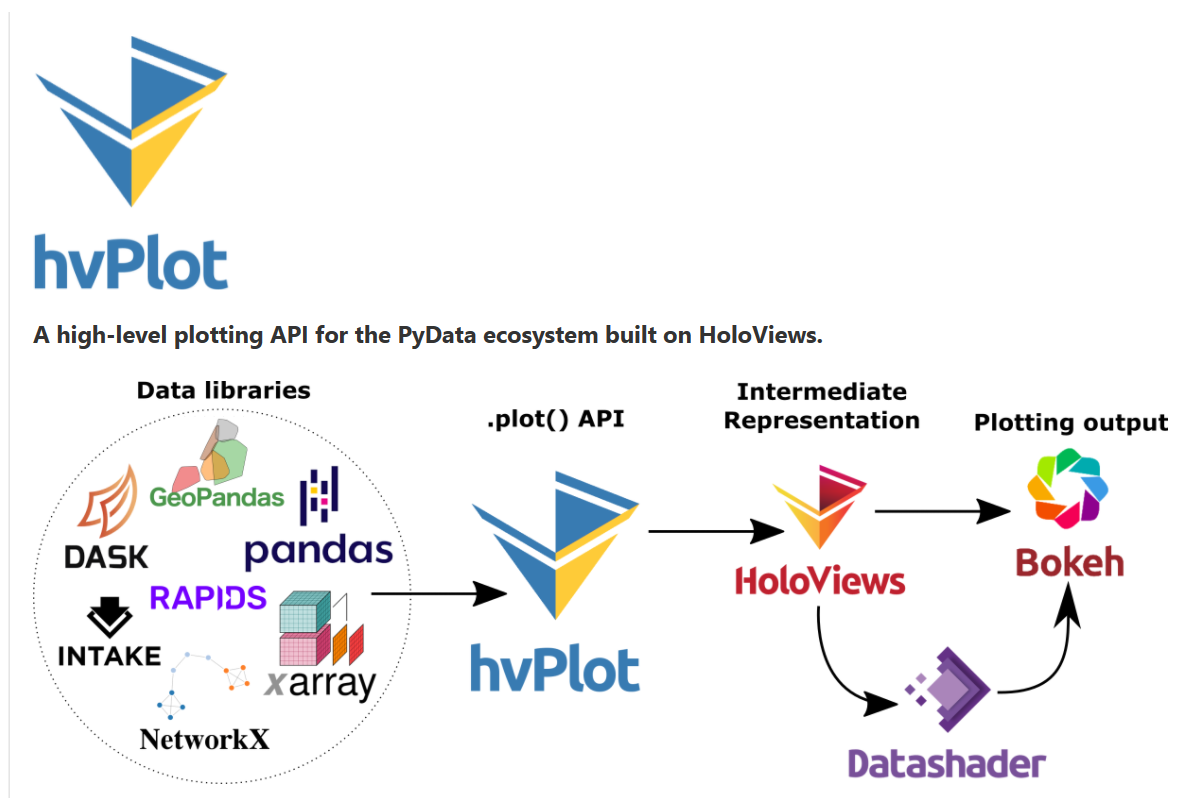
Hvplot, Bokeh made easy(ier)#
Bokeh#
is a very flexible JS visualization framework. Beautiful interactive charts but somewhat complex.
Example Bokeh Ridge plot
HoloViews#
is a higherlevel, declarative layer built on top of Bokeh (or MatplotLib)
Example Holoviews Violin plot
HVplot (HV == Holoviews)#
is some of Holoviews functionality implemented as a pandas extension.
Installing and loading#
conda install -c pyviz hvplot
pip install hvplot
Examples#
import hvplot.pandas

count_of_logons = logons_full_df[["TimeGenerated", "Account"]].groupby("Account").count()
count_of_logons.hvplot.barh(height=300)
plot_df = (
    net_full_df[["L7Protocol", "AllExtIPs", "TotalAllowedFlows"]]
    .groupby(["L7Protocol", "TotalAllowedFlows"])
    .nunique()
)
display(plot_df.head(3))
plot_df.hvplot.scatter(by="L7Protocol")
| AllExtIPs | ||
|---|---|---|
| L7Protocol | TotalAllowedFlows | |
| ftp | 1.0 | 1 |
| http | 1.0 | 12 |
| 2.0 | 16 |
plot_df = (
    logons_full_df[["TimeCreatedUtc", "Account", "LogonType"]]
    .assign(HourOfDay=logons_full_df.TimeCreatedUtc.dt.hour)

)
display(plot_df.head(3))
plot_df.hvplot.hist(y="HourOfDay", by="Account", title="Logons by Hour")
| TimeCreatedUtc | Account | LogonType | HourOfDay | |
|---|---|---|---|---|
| 0 | 2019-02-12 04:56:34.307 | NT AUTHORITY\SYSTEM | 5 | 4 |
| 1 | 2019-02-12 04:37:25.340 | MSTICAlertsWin1\MSTICAdmin | 3 | 4 |
| 2 | 2019-02-12 04:37:27.997 | MSTICAlertsWin1\MSTICAdmin | 3 | 4 |
Subplots#
plot_df.hvplot.hist(y="HourOfDay", by="Account", subplots=True, width=400).cols(2)
More parameters
plot_df.hvplot.hist(y="HourOfDay", by="Account", subplots=True, shared_axes=False, width=400).cols(2)
plot_df = (
    net_full_df[["L7Protocol", "AllExtIPs", "TotalAllowedFlows"]]
    .groupby(["L7Protocol", "TotalAllowedFlows"])
    .nunique()
)
display(plot_df.head(3))
plot_df.hvplot.violin(by="L7Protocol", height=600)
| AllExtIPs | ||
|---|---|---|
| L7Protocol | TotalAllowedFlows | |
| ftp | 1.0 | 1 |
| http | 1.0 | 12 |
| 2.0 | 16 |
Combining plots#
plot_df = (
    net_full_df[["L7Protocol", "AllExtIPs", "TotalAllowedFlows"]]
    .groupby(["L7Protocol", "TotalAllowedFlows"])
    .nunique()
)


plot_df.hvplot.scatter(by="L7Protocol", height=600) + plot_df.hvplot.violin(by="L7Protocol", height=600)
plot2_df = (
    net_full_df[["FlowStartTime", "AllExtIPs", "L7Protocol", "RemoteRegion"]]

    .groupby(["RemoteRegion", pd.Grouper(key="FlowStartTime", freq="5min")])
    .agg({"L7Protocol": "nunique", "AllExtIPs": "nunique"})
    .sort_index()
    # .head(500)
    .reset_index()
)
plot2_df.hvplot.scatter(y="AllExtIPs", alpha=0.5, height=500, by="RemoteRegion") * plot2_df.hvplot.line(y="L7Protocol", color="blue")
plot_df = (
    net_full_df[["FlowStartTime", "L7Protocol", "RemoteRegion", "TotalAllowedFlows", "AllExtIPs"]]
    .assign(MinOfDay=(
        net_full_df.FlowStartTime.dt.hour * 60) + net_full_df.FlowStartTime.dt.minute
    )
    .groupby(["FlowStartTime", "L7Protocol", "RemoteRegion", "TotalAllowedFlows", ])
    .nunique()
    .reset_index()
)
plot_df.hvplot.box(y="TotalAllowedFlows", by="RemoteRegion", rot=30, height=400) * plot_df.hvplot.violin(y="TotalAllowedFlows", by="RemoteRegion")
Seaborn for specialized stats plots#
![]()
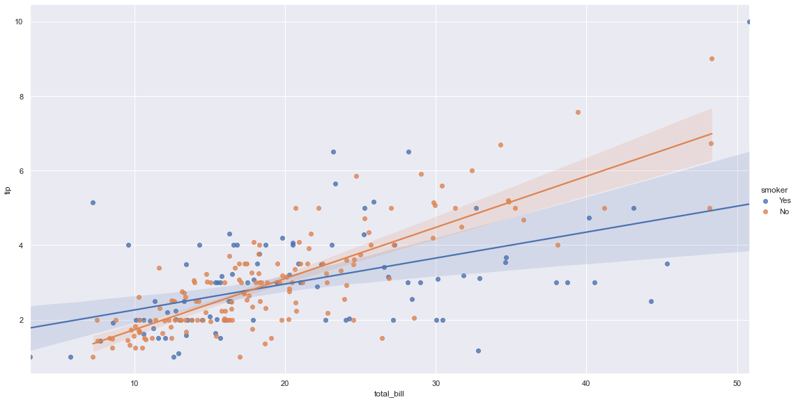
Intro: Seaborn is a Python data visualization library based on matplotlib. It provides a high-level interface for drawing attractive and informative statistical graphics.
Statistical specialization
Resources:
In below example, we are visualizing regression models with demo dataset provided by seaborn. The dataset has 2 quantitive variable and with this graph we can see how those variable are related to each other.
You can check more examples based on the data you have:
import seaborn as sns
sns.set_theme(style="darkgrid")

tips = sns.load_dataset("tips")
tips.head()
| total_bill | tip | sex | smoker | day | time | size | |
|---|---|---|---|---|---|---|---|
| 0 | 16.99 | 1.01 | Female | No | Sun | Dinner | 2 |
| 1 | 10.34 | 1.66 | Male | No | Sun | Dinner | 3 |
| 2 | 21.01 | 3.50 | Male | No | Sun | Dinner | 3 |
| 3 | 23.68 | 3.31 | Male | No | Sun | Dinner | 2 |
| 4 | 24.59 | 3.61 | Female | No | Sun | Dinner | 4 |
sns.lmplot(x="total_bill", y="tip", hue="smoker", data=tips, height= 8, aspect=15/8)
<seaborn.axisgrid.FacetGrid at 0x268db708048>
Plotly#
![]()
Data Visualization Using Plotly: Python’s Visualization Library#
By Meenal Sarda.
Plotly is an open-source library that provides a whole set of chart types as well as tools to create dynamic dashboards. You can think of Plotly as a suite of tools as it integrates or extends with libraries such as Dash or Chart Studio to provide interactive dashboards. Plotly’s Python graphing library makes interactive, publication-quality graphs.
Plotly supports dynamic charts and animations as a first principle and this is the main difference between other visualization libraries like matplotlib or seaborn.
Main Properties of Plotly:
It can be used with other languages such as R, Python, Java.
No JavaScript knowledge is required at all. You code Plotly in your choice of supported languages.
Each Plotly visual is a JSON object. In this way, the visual can be accessed and used in different programming languages.
With Plotly you can also build dynamic dashboards using Dash extension.
Chart Studio allows you to create and update the graphics you want without any coding. It has a very simple and useful interface. It is especially useful in areas such as business intelligence.
Plotly allows you to view the entire dataset in the same figure which is very important for the user experience.
Transforming Matplotlib charts to Plotly charts is supported.
Plotly has been added to the Pandas plotting backend with the new version of Pandas. So we can make plotting on Pandas without having to import Plotly Express.
Plotly Express#
The plotly.express module (usually imported as px) contains functions that can create entire figures at once, and is referred to as Plotly Express or PX. Plotly Express is a built-in part of the plotly library, and is the recommended starting point for creating most common figures.
Let’s import Plotly Express:
import plotly.express as px
We can create a bar chart by using the bar method:
# Preparing Dataframe
df = logontypebyacc.to_frame(name = 'Frequency')
df.reset_index(inplace = True)
# Creating bar chart
fig = px.bar(df, x = 'LogonType', y = 'Frequency', title = 'Logon Frequency by Logon Type')
# Forcing the X axis to be categorical. Reference: https://plotly.com/python/categorical-axes/
fig.update_xaxes(type='category')
# Presenting chart
fig.show()
Let’s create some visualizations to support the statistical analysis techniques we reviewed yesterday (Day 1 / Part 3 / Data Analysis with Pandas / Statistics 101)
import pandas as pd
import json

# Opeing the log file
zeek_data = open('../data/combined_zeek.log','r')
# Creating a list of dictionaries
zeek_list = []
for dict in zeek_data:
    zeek_list.append(json.loads(dict))
# Closing the log file
zeek_data.close()
# Creating a dataframe
zeek_df = pd.DataFrame(data = zeek_list)
zeek_df.head()
| @stream | @system | @proc | ts | uid | id_orig_h | id_orig_p | id_resp_h | id_resp_p | proto | ... | is_64bit | uses_aslr | uses_dep | uses_code_integrity | uses_seh | has_import_table | has_export_table | has_cert_table | has_debug_data | section_names | |
|---|---|---|---|---|---|---|---|---|---|---|---|---|---|---|---|---|---|---|---|---|---|
| 0 | conn | bobs.bigwheel.local | zeek | 1.588205e+09 | Cvf4XX17hSAgXDdGEd | 10.0.1.6 | 54243.0 | 10.0.0.4 | 53.0 | udp | ... | NaN | NaN | NaN | NaN | NaN | NaN | NaN | NaN | NaN | NaN |
| 1 | conn | bobs.bigwheel.local | zeek | 1.588205e+09 | CJ21Le4zsTUcyKKi98 | 10.0.1.6 | 56880.0 | 10.0.0.4 | 445.0 | tcp | ... | NaN | NaN | NaN | NaN | NaN | NaN | NaN | NaN | NaN | NaN |
| 2 | conn | bobs.bigwheel.local | zeek | 1.588205e+09 | CnOP7t1eGGHf6LFfuk | 10.0.1.6 | 65108.0 | 10.0.0.4 | 53.0 | udp | ... | NaN | NaN | NaN | NaN | NaN | NaN | NaN | NaN | NaN | NaN |
| 3 | conn | bobs.bigwheel.local | zeek | 1.588205e+09 | CvxbPE3MuO7boUdSc8 | 10.0.1.6 | 138.0 | 10.0.1.255 | 138.0 | udp | ... | NaN | NaN | NaN | NaN | NaN | NaN | NaN | NaN | NaN | NaN |
| 4 | conn | bobs.bigwheel.local | zeek | 1.588205e+09 | CuRbE21APSQo2qd6rk | 10.0.1.6 | 123.0 | 10.0.0.4 | 123.0 | udp | ... | NaN | NaN | NaN | NaN | NaN | NaN | NaN | NaN | NaN | NaN |
5 rows × 148 columns
We learned how a histogram can help us to describe the distribution of frequencies. We can create one to analyze the distribution of frequencies for the network connection duration using the histogram method.
# Creating histogram chart
fig = px.histogram(zeek_df, x = 'duration', title = 'Distribution of Frequencies', nbins = 1000)
# Presenting chart
fig.show()
Let’s now create a box plot to describe the variability of the network connection duration. We can use the box method to create box plots.
# Creating box plot
fig = px.box(zeek_df, x = 'id_resp_h', y = 'duration', title = 'Variability of Duration by Response IP Address')
# Presenting chart
fig.show()
MSTICPy visualizations#
Event timeline#
Basic plots#
import msticpy.vis.mp_pandas_plot

net_data = net_full_df.sort_values("FlowStartTime").tail(500)
net_data.mp_plot.timeline(time_column="FlowStartTime")
Grouping#
More parameters#
help(net_data.mp_plot.timeline)
Help on method timeline in module msticpy.vis.mp_pandas_plot:

timeline(**kwargs) -> bokeh.models.layouts.LayoutDOM method of msticpy.vis.mp_pandas_plot.MsticpyPlotAccessor instance
    Display a timeline of events.

    Parameters
    ----------
    time_column : str, optional
        Name of the timestamp column
        (the default is 'TimeGenerated')
    source_columns : list, optional
        List of default source columns to use in tooltips
        (the default is None)

    Other Parameters
    ----------------
    title : str, optional
        Title to display (the default is None)
    alert : SecurityAlert, optional
        Add a reference line/label using the alert time (the default is None)
    ref_event : Any, optional
        Add a reference line/label using the alert time (the default is None)
    ref_time : datetime, optional
        Add a reference line/label using `ref_time` (the default is None)
    group_by : str
        The column to group timelines on.
    legend: str, optional
        "left", "right", "inline" or "none"
        (the default is to show a legend when plotting multiple series
        and not to show one when plotting a single series)
    yaxis : bool, optional
        Whether to show the yaxis and labels (default is False)
    ygrid : bool, optional
        Whether to show the yaxis grid (default is False)
    xgrid : bool, optional
        Whether to show the xaxis grid (default is True)
    range_tool : bool, optional
        Show the the range slider tool (default is True)
    height : int, optional
        The height of the plot figure
        (the default is auto-calculated height)
    width : int, optional
        The width of the plot figure (the default is 900)
    color : str
        Default series color (default is "navy")
    overlay_data : pd.DataFrame:
        A second dataframe to plot as a different series.
    overlay_color : str
        Overlay series color (default is "green")
    ref_events : pd.DataFrame, optional
        Add references line/label using the event times in the dataframe.
        (the default is None)
    ref_time_col : str, optional
        Add references line/label using the this column in `ref_events`
        for the time value (x-axis).
        (this defaults the value of the `time_column` parameter or 'TimeGenerated'
        `time_column` is None)
    ref_col : str, optional
        The column name to use for the label from `ref_events`
        (the default is None)
    ref_times : List[Tuple[datetime, str]], optional
        Add one or more reference line/label using (the default is None)

    Returns
    -------
    LayoutDOM
        The bokeh plot figure.
Event duration#
Matrix plots#
Simple interactions
(
    net_data[~net_data["L7Protocol"]
    .isin(["http", "https"])]
    .mp_plot.matrix(x="L7Protocol", y="AllExtIPs", invert=True)
)
Process Trees#
End of Session#
Break: 15 Minutes#